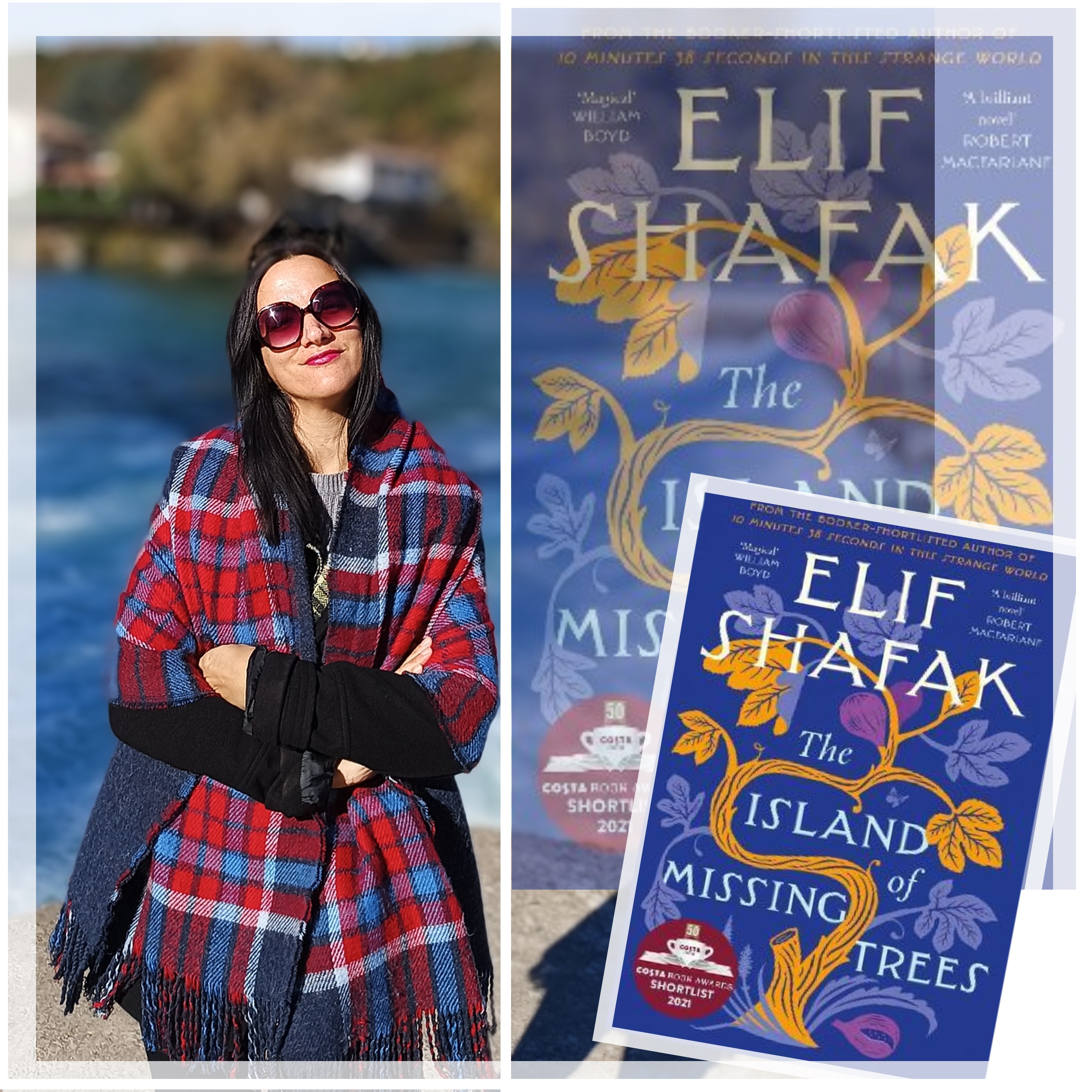
A FASHION ILLUSTRATION OF MYSELF: ACRYLIC PAINTS (STOBREČ)
Hello dear readers! In this post, I'll share three original fashion illustration of an outfit I wore to visit Stobreč (Croatia). While I was in Split, Croatia, I also paid Stobreč a short visit. Following my visit, I decided to illustrate the black and burgundy outfit I wore. Sometimes I illustrate my own outfits. Why not? That way I can have an actual illustrated version of my closet, not just a digital version on this little place to call my own. And to think I thought that digital closet from Clueless was the coolest thing? This is way cooler!
I used acrylic paints on mixed media paper for these illustrations. Some would say that acrylic paints are not suitable for fashion illustration, but I have been breaking that rule ever since I started doing fashion illustrations years ago. I even used oil paints for my fashion illustrations. For those interested in the fashion illustration making, I will walk you through the process in this post.
I didn't find these illustrations as easy as I expected them to be. Not as difficult as the seascape painting I'm working on, but not easy either. Between the seascape and these illustration, my spine has been sending me copious amounts of hate mail. I took me quite some times to finish these fashion illustrations, I wasn't able to do it in one go as I had originally hoped. However, I'm pretty satisfied with the result. As regular readers of my blog know, fashion illustration has always been a fascination of mine. Over the years, I have shared thousands of original fashion illustrations drawn in different styles on this blog.


THE STORY OF MY OUTFIT AND THE REFRENCE PHOTOGRAPH
An illustration of my outfit usually starts with a reference photograph of my outfit. If there is something I have an abundance of, it's reference photographs of my outfits. Fortunately, I have a husband who has been taking hundreds of photographs of me weekly- and ever since we met. I might be more photographed than princess Di, just not more published. I don't post everything on this blog. You don't need to see a million photographs of me every day. However, I digress.
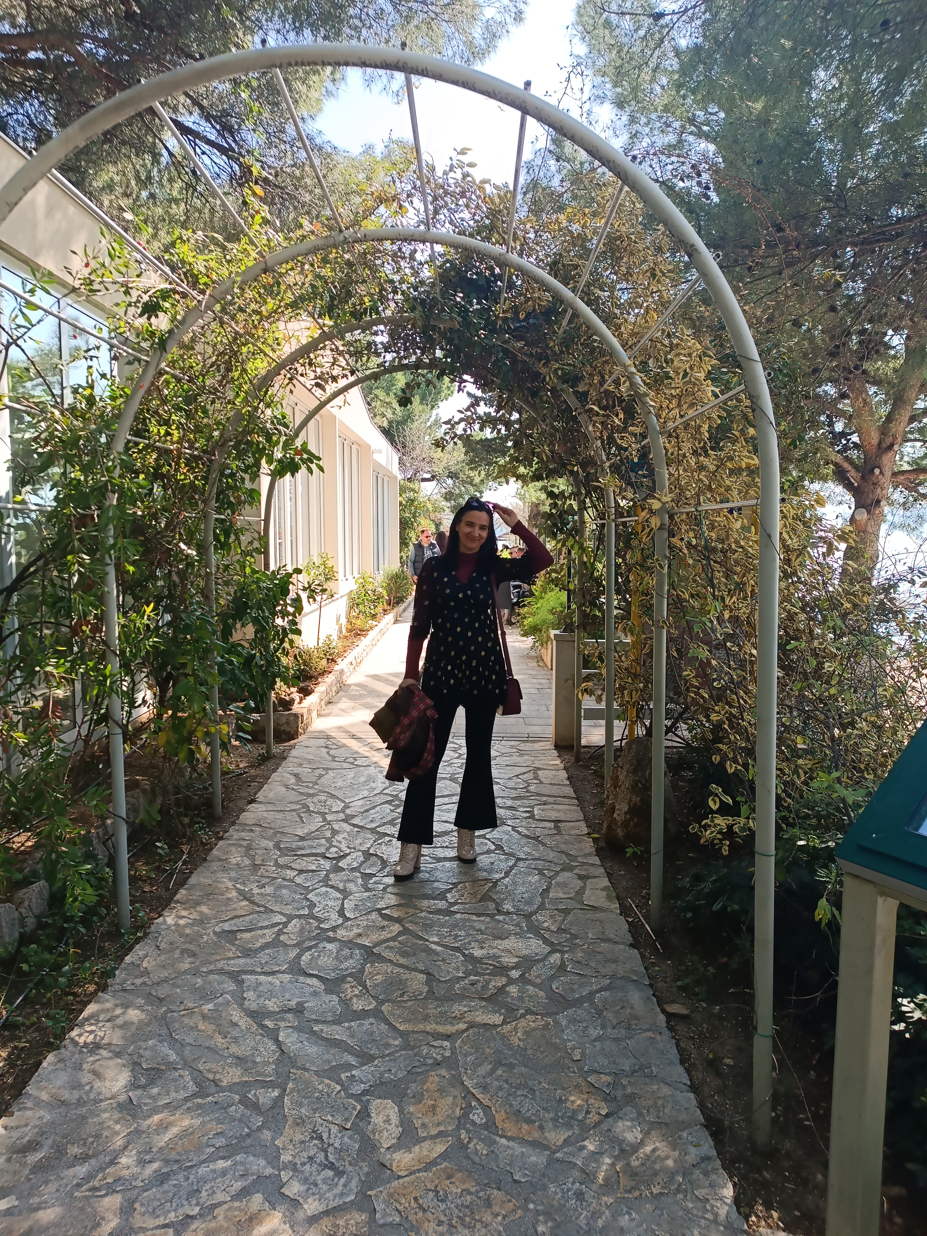
While in Split, I went to a second hand shop and found a black lace dress. I bought a few dresses and shirts, and all of that costs me only a few euros. I didn't find anything spectacular. I'm noticing more fast fashion items in second hand shops and that really demotivates me because what is the point? The reason why I'm motivated to thrift is to find vintage items, fast fashion is just not very inspiring. My apologies, I digressed again.
When I got back from the shop, I didn't try anything on yet because I'm a germaphobe so I had to wash and dry everything first. When that was done, I tried everything I bought and this outfit was really to my liking, so I decided to wear it to Stobreč where we agreed on a coffee with my brother and sister-in-law.
I posed for a few pictures holding a bouquet of Japanese roses my husband bought for me on International Women's day in March. Yes, this is actually a March outfit. These pictures that were never meant to be posted ended up as a reference. I was just fooling around at the time, but it turned out to be a fun reference pose to capture. So, you never know what might inspire you. While I was browsing my archives a week or so later, these were the pictures that caught my eye. As you will see, I ended up illustrating it all- the boquet, the red vase the flowers were in-and even the cellophane the flowers came in. So, that is where the story of these three fashion illustrations begins!
 |
| Fashion illustration vs. reference photographs |

 |
| The initial fashion sketch with a red watercolour pencil |
The first pose and sketch was the one I probably put the most effort into. I added details and stuff. I free styled these sketches and I didn't measure anything in anyway.
ENLOGATED STYLE IS OFTEN THE NORM WHEN IT COMES TO FASHION ILLUSTRATION
The elongated style is often the norm when it comes to fashion illustration. It is used for a variety of reason. It is simply a part of fashion illustration aesthetics. The prestige of height, the ethereal effect or its association with runaway models is not the only reason for employing the elongated style. One of the reasons can be to better showcase the garments or move focus onto other details.
So, normally when doing art or illustration, you are taught a body is eight heads long. It is a standard measure employed in art since the ancient Greeks. Seven and a half is a more anatomically accurate measure ( at least for a majority of people) but eight heads is the standard. However, I see that seven heads is also often used today, so maybe the classical Greek style is not the standard anymore. Anyway, if you want to draw realistically seven, seven and a half or eight head measure would be just fine.
For the classical elongated fashion illustration, you will add a head or two of height. Nine or even ten heads is often used in fashion illustration. Of course there are no rules. You can create your own style. I'm just stating something that is commonly known, but can still be useful to revise.
How many heads there are in these illustrations?
Just by looking at them, I would say that the first one is more realistic. Not that I had any plans for them. Perhaps I got tired after sketching the first one and then I sort of did the other two without thinking- and they ended up being drawn in the elongated style, something I usually do when I sketch fashion illustration freehand. Perhaps elongated style has become second nature to me. Something I naturally gravitate to when doing fashion illustration now.
This might change. I might start doing more realism in fashion illustration. Who knows? This talk of proportions got me intrigued, and I measured my illustrations so I can test my hypothesis.

IT DIDN'T MEASURE THE PRIOR BUT FOR PURPUSE OF THIS POST I SHALL DO IT NOW
Yes, I decided to measure them now. I couldn't see a ruler within reach, so since I didn't feel like looking for a ruler so I used a post it, but anyway I was right.
The first illustration is more realistic in proportion (seven and half heads), while the others are more elongated (approximately ten heads). The second one is the most elongated one, the third one the least and the first one is not elongated at all. Well, I didn't need to measure them to confirm but still as I'm talking about fashion illustration, it makes sense that I put some numbers behind my words. You can measure it yourself if you'd like (for educational purposes of course).

So, after sketching these illustrations, came the colouring part. I used acrylic paints to colour them. My outfit was mostly composed out of black and burgundy. To get burgundy I mostly mixed red with green. To get the golden colours of the dots, I mixed yellow with red and white. This was pretty simple as the colours were concerned, it was not really a problem. Skin colour was yellow, red and white, mixed together of course. Some green for the flower bouquet and red and white of course. I didn't even have to open all of my tubes for this one.
Still, the fashion paintings took me some time, because I wanted them to look nice and neat. So, I coloured with a bit of care, adding colours in layers. I wasn't going for a very realistic feel but I wanted it to look realistic to a point.
Painting did pose some challenges. It always does. As one artist recently said, art is about decisions. Do I capture the light or not? How do I emphasize the fabric details on such a small painting? Do I worry about this detail or not? Is it fine if I just colour over this or not?
 |
| A fashion painting in three stages: a sketch, almost completed, completed! |
The first illustration is the one I put the most effort into. First I coloured the darker areas and then I started working on the details. The fact I was wearing sunglasses made painting my face a lot easier. Just a few shadows for the nose and a bit of red for the lips. Splendid! Moving onto the rest of the outfit.
Painting the black flared leggings wasn't difficult and I actually enjoyed that part the most. I think I did a got job captured them in this illustration, especially the subtle flare at the end. This pair of leggings is very flattering (a bit less comfortable because they're a little small). What makes it so flattering is that it's actually a bit cropped. Worn with heels, these leggings give an elongating effect. I often pair them with dresses and tunics. There's a whole story about this pair of black leggings. In fact, I got them from a former colleague. We worked the summer together and upon parting we decided to swamp two clothing items so we can always remember one another. So, she gave me these leggings and I gave her my long floral cardigan.

Let's talk about painting the shoes, these pale pink laced up high heeled boots I had acquired at the start of these year. As you can see, they kind of have a central part in this illustration. If I remember well, this whole pose was about putting them in the spotlight. I started filling them in with red and white (mixed together of course!) to get that pale white colour in, making the shadows more darker red. I used the black for the soles because that's the colours the soles are obviously but I refrained from using black anywhere else to stay true to their design. So, I simply used a darker rose shade to paint over the darker parts. I added almost pure white to highlight some parts of them. As these shoes are patent leather shoes (at least I think) they catch light and seem white at some parts. I'm quite happy with how I managed to capture that.
Another thing that I was quite happy with were the flowers. I painted everything- the vase, the flowers and even the cellophane that was still around the flowers. I felt like it really added something to this fashion painting to have details like that.

As I was finishing up this first fashion illustration, I also worked on the other two filling in the colour. Still, to really finish the first one, I needed to get if not at all at least some of the details. I painted the dress trying to capture the lace details. This black dress with golden polka dots has lovely lace details at the bottom and the sleeves. That's probably the reason why I picked it up in the second hand shop, for I love lace details. I made some parts of the dress daker and some lighter. This dress is sheer when it comes to its sleeves. There's also a sheer layer over the bottom of the dress. I think I managed to capture the sheerness of it quite well.

I also worked on the details of the dress such as the golden polka dots and the lace details at the hem of the sleeves and the dress. The final touch was the face. I painted the sunglasses, the mouth, the nose and so on. I worked on the fingers some more. I can't say that I was really completely happy with the fingers, but I decided that I'll leave them as they were. Not everything has to be perfect. It just has to make sense. Looking back on this painting, what I'm really happy about are some details, like the reflections on the pale pink shoes and the flowers. I think there's a feeling of flow to the dress. All together, I would say that it is a successful fashion illustration. It's nice to look at and it looks finished. Part of its appeal is definitely came from sketching the reference photographs and trying to capture that feeling of playfulness. Moral of the story- Picking the right reference photograph can inspire you!

Moving onto the other illustrations. First of all, there is a collage that shows the whole making of process below. As you can see, I finished the first illustration first and then I moved onto the other ones. What were some of the challenges there? Well, there are always challenges.

The second one was a bit of a challenge just because I didn't have my sunglasses on, so I had to paint my eyes on a very small surface. Moreover, because of my poses in the second and the third illustration, it wasn't easy to portray the movement of the dress. Finally, I was holding a jacket in both of the reference photograph. I wasn't sure whether to keep it or not, but in the end I decided to keep it. Painting this burgundy checkered jacket proved difficult for some reason. Neither was the burgundy bag easy to paint. Not because of its colour obviously. Burgundy is so easy to mix together. Putting in the shadows and highlights wasn't difficult either. What was a bit challenging was the placement of the bag and the dress, and deciding on little details like that.

I wasn't really going for capturing the light in these fashion illustrations, but I did capture some reflections. The second and the third reference photographs are obviously darker as I was standing in the shade when they were taken.
The painting process was similar but not the same. You'd think that it would be easier painting the same outfit three times but actually it wasn't. I still struggled with many decisions. How to I emphasize the dress flare shape? Do I just add in more black?
The details on the burgundy jackets were also tricky. Should I even try to do its checkered pattern? Is it even visible on the painting? Even though the poses number two and three are similar there were still some differences.

The easiest thing to paint was again the flares. I didn't give them much attention and later wonder should I have done a better job, but then decided that it was fine. The pink shoes were time consuming to paint again, but also fun. The golden polka dots came out darker because as I said, I was standing in the shade. I tried to capture the general feelings of these poses and light. I didn't completely copy from the reference, though. By that I mean to say that I made some changes to the reference photographs.


It is a lovely location these photographs were shot at. Stobreč is filled with lovely cafes and restaurants. Anyway, my illustrations were drawing to the close. This time I did use some black when painting these pale pink high heeled boots because the shadows were darker. That's the thing. You might paint the same outfit, but it will be different in a different light. So, I painted the burgundy top, the black partly sheer black dress with the golden polka dots. The leggings and the winter jacket in my hand.

The second one was done. The third one was almost done. Towards the end, I noticed that my sunglasses weren't really leveled in the third painting, but I gave up on trying to fix it. There are a lot of things that could be fixed in any painting and as a painter, you have to learn when something is worth the correction and when not. I mean looking at these, I can see a million things that could be different, but you have to learn to move on if you're to finish anything.
I took quite a few photographs of my finished illustrations. Maybe I was just relieved that I was done and worried I might be tempted to correct something again. Still, I think it's interesting to see art more up close. Especially acrylic and oil art. This way you can see the thickness of the paint and the movement of the brushes better. Funny how these illustrations seem to glow under the sun, isn't it?
Plus, you can see that it's not AI art. Not that you would think that of course. But with so much AI art around, I imagine people like to have a look at something that AI art can't give, such as a detailed view from different sides and perspectives of a painting.

Now, time for another view of the completed unedited three illustrations, shot in natural shade. I mean most of these are either shot in shade or under natural sunlight. I sometimes edit photographs I put in collages, but most of my art that I post is unedited. The quality of these photographs might not be perfect as I don't have professional equipment at hand, but that's alright, too. I think you can see well enough.

Now that I have walked you through these three fashion illustrations, the first one being more detailed and realistic, and the second and the third one being more rushed and elongated, it's time to talk about the location and the inspiration behind it all- the outfit and the illustrations. In other words, let's talk about Stobreč a bit. Look at those views and mountains. Seagulls, the beach, the ships...it's a lovely and inspiring place to be!

OUR SPRING VISIT TO STOBREČ, A SEASIDE SETTLEMENT THAT ALMOST FEELS LIKE A PART OF SPLIT CITY


SUSTAINABLE FASHION FILES- THE STORY OF MY OUTFIT


1) Black flared leggings worn with a long cardi, black high heeled boots and a red puffer jacket in February 2025.
2) Black flared leggings worn with a black tunics, pointy stiletto heels and a black and gold vintage vest in January 2025.
3 & 4) Black flared leggings worn two ways with two black and white outfits in November 2024.
5& 6) Black flared leggings worn with two outfits featuring the same olive blazer in 2024.
7) Black flared leggings worn with a geometrical green dress and a black blazer in May 2024.
8) Black flared leggings worn with a mini blue dress and BW sneakers in January 2024.
9) Black flared leggings worn with a mini skirt and a red checkered jacket in March 2024.
10) Black flared leggings worn with a red top with lace details and high suede heels in July 2023.
11) Black flared leggings recently with a camel coat in this 2025 post.
12) Black flared leggings worn with a black dress with golden polka dots, pink heels and a burgundy bag and jacket (outfit I wore today).

Time for me to go and enjoy my cup of fine Croatian espresso with a beautiful seaside view.


Before we wrap this post up, here are a few more images of my fashion illustrations. These fashion illustrations are a lovely memento of a lovely sunny Spring Sunday. I have quite a few illustrations of my own outfits by bow. Recently you had a change of seeing one with pencil drawings, it's linked up above.
FRIDAY FASHION ILLUSTRATION: SPRING STYLING


Great art work and amazing outfit. Lovely photos too :-D My daughter is learning to draw.
ReplyDeleteThanks for your lovely comments. I loved the little story about the snail and the raspberry :-D
Thank you! I've been using writing stories as a teaching tool, a little trick I learned from my teacher colleagues.
DeleteThe striking similarity with the original pose is commendable.
ReplyDeleteThank you Benita!
DeleteBeautiful photos and amazing illustrations.
ReplyDeleteThank you!
DeleteYour fashion illustrations are always a delight and I love following its different stages. You are so very talented, Ivana, whether it's seascapes or fashion illustrations!
ReplyDeleteI also loved visiting Stobreč with you and your husband. xxx
Thank you, Ann. It can be tricky doing art but I'm not giving up.
DeleteDevo dire che i colori acrilici rendono molto meglio (almeno allo schermo del pc): i colori sono così vividi e brillanti che sembrano animare l'illustrazione!
ReplyDeleteSuper carino il tuo look, sei sempre originale e stilosa, Ivana! Adoro i tuoi stivaletti rosa!
Baci!
S
https://s-fashion-avenue.blogspot.com
A me piace usare i colori acrilici per le illustrazione di moda. :)
DeleteYour talent is amazing. God Bless you in all you do. Thank you for giving me a smile today.
ReplyDeletewww.rsrue.blogspot.com
Thank you so much. God bless you too!
DeleteTe quedo genial. Te mando un beso.
ReplyDeleteGracias!
DeleteHello, Ivana! I like your outfit!
ReplyDeleteThank you Irina.
DeleteGorgeous outfit and your fashion illustrations are fabulous.
ReplyDeleteHave a wonderful day!
I'm glad you enjoyed them.
DeleteYour husband and you are beautiful and so happy in the pictures! The illustrations show your genius Ivana... It's hard to draw yourself, but the way you draw is great and I really like it! Happy Easter soon dear Ivana🥰🫶
ReplyDeleteThank you Leone!
DeleteSo wonderful to see your art! Such a great outfit. Love those pants. thank you for the great post. So good to see those photos of you 2 together. Thank you so much! Thank you for your comments too. Wishing you a great week and beyond.
ReplyDeleteThank you Ellie!
DeleteAwesome to see your post. So great to see you and your wonderful art and more. Such an amazing post. OH, so great to know about this dress too. Thank you for being here. Wishing you and yours some amazing moments this month and more. Thank you for reading and thank you for your comments. Such an amazing blog you have. Always inspiring!
ReplyDeleteThanks dear. Have a great month yourself!
DeleteDear I think that you caught in perfect way your outfit. Your fashion illustrations are awesome. Well done girl
ReplyDeleteThank you!
DeleteHi
ReplyDeleteYour digital closet is superb! I think it must be unique!
I think you manage to capture the design of your body very well in a very elegant way. I liked the description and I'm glad you did it because I think few people can imagine the work involved in art. I liked the movement you gave the illustrations, and the boots are beautiful btw! I think this look is a hallmark of your personal style. I also really enjoyed the photos with your husband and getting to know another city in Croatia, which I think is a beautiful country with a fantastic history! Hugs and Happy International Women's Day!
Thank you dear Marisa!
DeleteLOL at you having might be more photographed than princess Di ;p As always your creation process is always as fascinating as the finished product. As creators, we'll always have little things we wish we could correct in our work but sometimes you just have to get to a point where you realize it's time to stop.
ReplyDeleteYes, he does like to take my pictures.
DeleteI agree.
You have to stop sometime.
I love the illustrations and I also like the sketches with the red pencil. Have you ever thought to going over it with a black ink pen and having a lose sketch kind of like Garance Dore?
ReplyDeleteThe Japanese roses are beautiful how thoughtful and your travels looked great what gorgeous beaches!
Allie of
www.allienyc.com
I'm familiar with Garamce Dore style. I haven't and I don't presently plan to paint in that style.
Delete*Garance (sorry, typo)
DeleteIvana ficaram maravilhosas as ilustrações gostei muito, Ivana boa Páscoa bjs.
ReplyDeleteObrigada!
DeleteThis was such a delightful post to read full of warmth, artistry, and personality. Your fashion illustrations carry not just style but also a beautiful sense of storytelling and memory, particularly the connection between the outfit and the location.
ReplyDeletehttps://www.melodyjacob.com/2025/04/best-way-to-style-denim-on-denim-pointed-heels.html
Thanks dear Melody!
DeleteGreat outfit. I'm a fan of your illustrations. You see the essentials.
ReplyDeleteThank you Andrea!
DeleteWOW great art, you look so beautiful as always.
ReplyDeleteThanks
Delete